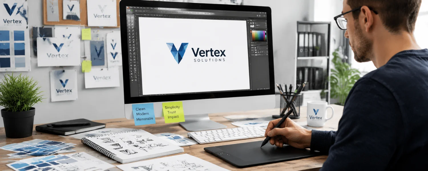
Your brand logo is the face your audience meets first. In seconds, it signals what you stand for, the quality you deliver, and whether visitors should trust you. Designing a standout brand logo for your website doesn’t require a massive budget or advanced design skills—you need a clear story, smart choices, and the right tools. Use this expert playbook to create a logo that looks sharp everywhere, scales effortlessly, and feels unmistakably you.
Start With Strategy: Story, Audience, and Positioning
1) Start with the power of your story
The most persuasive logos are rooted in a real “why.” Profits keep a business alive, but purpose makes it matter. Before sketching, write 2–3 sentences on why your company exists and how you want people to feel. Coca‑Cola’s script evokes warmth and shared moments; it’s not just soda. Translate your why into visual cues—colors, shapes, and type that capture your mission and mood.
2) Explore keywords defining your brand
Turn your narrative into tangible direction. Brainstorm 5–10 words that reflect what you do and why it matters (e.g., “sustainable, calm, precise, playful, premium”). Use a thesaurus to deepen options. Let these guide choices for style, color, and type so your logo expresses your values at a glance.

Choose Your Creation Path: DIY Tools or Design Help
3) Using an online logo maker
Modern logo makers (e.g., Looka, Shopify Hatchful, LogoMakr, Logo Garden, DesignMantic, Logo Maker) can jumpstart ideas. Enter your brand name, industry, and style preferences; then refine. Improve results by:
- Feeding the tool your story keywords for better alignment.
- Testing multiple templates, then customizing layout, color, and type.
- Exporting vector or high-res files and reviewing on real mockups (your site header, socials, packaging).
4) Using Canva (step-by-step)
Canva’s templates make DIY design approachable without looking generic. Try this workflow:
- Create or sign in to Canva, go to Marketing Content → Logo.
- Pick a template that fits your vibe, then customize: type, color, spacing, iconography, and negative space.
- Use brand keywords to filter icons/illustrations; keep lines clean and forms simple.
- Export as SVG for web UI when possible; add PNGs with transparent backgrounds for raster contexts.
Tip: Build a mini brand kit in Canva with your colors, type, and logo versions to keep everything consistent across posts and pages.
Design Building Blocks: Color, Type, Shape, and Clarity
5) Colors
Color sets tone and triggers emotion. Choose 1–2 primary colors plus neutrals; define tints/shades for flexibility. Consider color psychology (e.g., blue = trust, green = growth, red = energy) but prioritize differentiation in your category. Ensure your logo remains legible in one color for stamps, embossing, and low-ink use. Keep contrast strong for accessibility.
6) Typography
Type carries personality. Serif suggests tradition and craft; sans‑serif reads modern and clean; scripts feel human and expressive; display fonts add flair in moderation. Pair no more than two typefaces. Check legibility at 16–24 px and licensing terms for web/print. Adjust letterspacing and weight so the wordmark reads clearly at small sizes.

7) Right pixel matters (formats and clarity)
For the web, SVG is ideal for most logos: it’s vector, razor‑sharp at any size, lightweight, and supports dark mode with CSS. Use transparent PNGs for raster contexts (presentations, email signatures, platforms that don’t accept SVG) and JPG only for photos or complex gradients on light backgrounds. Export 2× or 3× PNGs for retina displays if SVG isn’t an option.
8) Secure the ability to scale
Your logo must look great from billboards to browser tabs. Design a responsive logo system with lockups: horizontal (site header), stacked (print/social), and icon-only (favicon/app). Keep shapes simple, avoid hairline strokes, and ensure every element remains legible at tiny sizes.
9) Allow time for thoughtful consideration
Great logos mature through iteration. Move from sketches to vectors, then pause. Review after a day with fresh eyes, test on real backgrounds, and gather feedback from your audience or a small panel. Rushing invites rework later; measured pace yields confidence now.
10) Evaluate your logo
Stress‑test your design with a short checklist: Does it work in one color? Is it legible at 16 px? Is it unique in your market? Does it reflect your “why”? Would you still love it in five years? Use a logo grading tool or a simple scorecard to rate clarity, memorability, versatility, and brand fit.
Website Essentials: Sizes, Variations, and Performance
Header logo sizes (desktop and mobile)
- Desktop: 40–60 px height is common; width scales proportionally.
- Mobile: 24–32 px height; ensure touch targets around it remain usable.
- Prefer SVG in your header for crispness at any breakpoint. If using PNG, export at 2× or 3× the displayed size (e.g., display 150 px wide → export 300–450 px).
Favicons and app icons
- Favicon: 16×16 and 32×32 PNG (or .ico for legacy), plus 48×48 for some browsers.
- Apple touch icon: 180×180 PNG.
- PWA/Android: 192×192 and 512×512 PNG.
- Use a simplified icon-only mark for tiny contexts; test at 16×16.
Social profile and post images
- Instagram: 320×320 profile (upload square, centered mark).
- Facebook Page: 170×170 (desktop), 128×128 (mobile) profile.
- LinkedIn: 400×400 profile; 1128×191 cover.
- X (Twitter): 400×400 profile; 1500×500 header.
- Always center the icon, add safe margins, and export at 2×.

Dark mode and accessibility
- Create light and dark versions (or a single adaptive SVG controlled by CSS).
- Ensure sufficient contrast around your logotype and tagline; while WCAG contrast doesn’t strictly apply to logos, readability still matters.
- Add descriptive alt text for SEO and screen readers (e.g., “Acme Kids Learning — star icon and wordmark”).
Performance best practices
- Inline or preload small SVG logos to avoid layout shift.
- Optimize SVGs: remove metadata, collapse paths, and set fill/stroke via CSS when practical.
- Serve the smallest necessary PNG fallback and cache aggressively.
From Idea to Execution: A Practical Workflow
Discovery and direction
- Write your brand story and pick 5–10 guiding keywords.
- Collect 10–15 reference logos that align with your direction (moodboard).
- Identify your competitive set and avoid similar motifs to stay distinctive.
Concept and craft
- Sketch 20–30 quick concepts; favor simple, iconic forms and negative space.
- Vectorize the best 3–5 in a design tool; build on a grid for balance and spacing.
- Test type pairings; adjust kerning and optical alignment by eye, then by grid.

System and specs
- Create responsive lockups: horizontal, stacked, icon-only.
- Define a core color palette (primary/secondary/neutral) and one-color variants.
- Export deliverables: SVG, PDF/EPS (print), PNG (transparent) in multiple sizes.
Proof and polish
- Mock up on your website header, mobile nav, favicon, and social avatars.
- Run a 5‑second test: show the homepage to users, hide it, ask what they remember.
- Refine based on clarity, memorability, and contrast feedback.
Legal, Licensing, and Brand Governance
- Trademark checks: Search your jurisdiction’s database (e.g., USPTO/TESS, WIPO Global Brand Database) for conflicts.
- Font and icon licenses: Ensure commercial rights for web and print.
- Domain and social handles: Secure consistent naming.
- Brand guidelines: Document logo clear space, minimum sizes, color codes (HEX/RGB/CMYK/Pantone), typography, and do/don’t rules.
Smart Use of Tools Without Looking “Template”
- Customize deeply: swap icons for original shapes, refine spacing, and tweak letterforms.
- Limit visual effects: avoid drop shadows, bevels, and busy gradients that don’t scale well.
- Test in monochrome first; add color last to confirm the form works on its own.
Budget and Timeline Benchmarks
- DIY/logo maker: $0–$100; 1–3 days with focused iteration.
- Freelancer: $500–$5,000; 2–6 weeks, includes exploration and revisions.
- Studio/agency: $5,000–$50,000+; 4–12+ weeks with research and full brand system.
Regardless of budget, the essentials don’t change: clear story, simple form, and consistent application.

Common Mistakes to Avoid
- Overdetail: Thin lines and micro‑details vanish at small sizes.
- Trendy type: Overused fonts age quickly and hurt distinctiveness.
- Poor contrast: Low contrast kills legibility, especially in dark mode.
- Raster‑only delivery: Insist on vector (SVG/EPS) for future‑proofing.
- Skipping legal checks: Similar marks in your category can cause costly rebrands.
Logo Evaluation Checklist (Save This)
- Meaning: Does it express your story and positioning?
- Memorability: Can someone sketch it from memory after a quick glance?
- Versatility: Do horizontal, stacked, and icon variants work?
- Scalability: Is it clear at 16 px and strong at billboard size?
- Simplicity: Could you remove a detail and make it stronger?
- Contrast: Is it readable in light and dark contexts?
- Uniqueness: Is it distinct from competitors and templates?
- Technical: Do you have SVG, EPS/PDF, and PNG exports with clear naming?
Edited and Enhanced Original Tips (Refined for Clarity)
1. Starting with the Power of Your Story
Your logo should reflect not just what you sell but why you exist. Like Coca‑Cola’s script that evokes warmth and celebration, use colors, shapes, and typefaces to convey your purpose. Think of your logo as the title of your brand’s movie—short, evocative, and true to your mission.
2. Explore Keywords Defining Your Brand
Translate your story into 5–10 precise words that capture both what you do and why it matters. Use these to guide aesthetic choices—style, color, and typography—so your logo visually communicates your brand’s essence.
3. Using an online logo maker
Tools like LogoMakr, Logo Garden, DesignMantic, and Logo Maker simplify the process: enter your name, industry, and style, then customize. Personalize layouts, icons, and fonts so the result feels uniquely yours, not templated.
4. Using Canva
Create or log in to Canva, choose Marketing Content → Logo, and select a template to customize. Adjust type, spacing, color, and add shapes or icons. Export as SVG for web when supported, and PNG with transparency for layered use. PNGs are ideal when you need crisp raster exports or transparent backgrounds across colored surfaces.
5. Colors
Choose colors that mirror your brand’s personality and apply them consistently across your site and marketing. Use color psychology to guide perception, but prioritize clarity and distinctiveness within your category.
6. Right Pixel Matters
For web UI, prefer SVG for scalability and crispness. Use transparent PNGs when SVG isn’t supported or for raster contexts; they blend cleanly on any background without white boxes or jagged edges. Export at 2× or 3× for retina clarity.
7. Typography
Pick fonts that complement your logo’s tone and remain legible at small sizes. Combine no more than two families, balancing character with clarity. Fine‑tune spacing and weight to achieve a polished, professional look.
8. Secure the Ability to Scale

Design a versatile system that works on print, web, social, and merch. Ensure every element is readable at micro and macro scales, from pen clips to billboards.
9. Allow Time for Thoughtful Consideration
Take the process step by step. Quick decisions risk later redesigns; thoughtful iteration saves cost and builds a stronger identity.
10. Evaluate Your Logo
Grade your logo’s clarity, memorability, and versatility with a checklist or logo grader tool. Validate with a few users in your target audience before finalizing.
Deliverables You Should Receive (or Prepare)
- Logo files: SVG (primary), EPS/PDF (print), PNGs (transparent) at multiple sizes.
- Lockups: horizontal, stacked, icon-only; light/dark versions.
- Color specs: HEX, RGB, CMYK, Pantone (if needed).
- Typography: primary/secondary fonts with licensing details.
- Brand sheet: clear space, minimum sizes, usage do’s and don’ts.
Final Practical Tips to Launch with Confidence
- Place your SVG logo in the site header and set its fill via CSS for effortless dark mode.
- Create and upload correct favicon and Apple touch icons; test on multiple devices.
- Add descriptive alt text and compress assets; measure CLS and LCP for performance.
- Announce your new logo with a short brand story post to build emotional connection.